# Creative Strategies for Crafting Unique Cover Images
Written on
Chapter 1: Introduction to Unique Cover Images
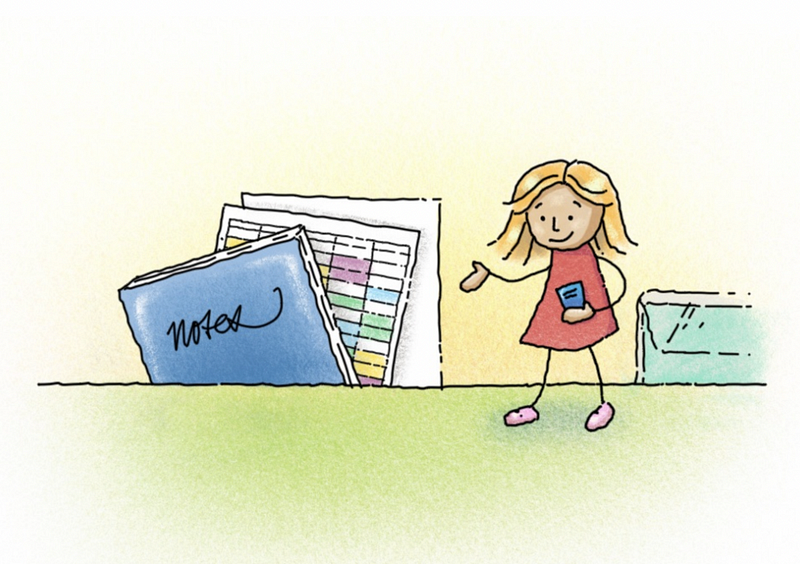
Congratulations, talented writer! You've composed an outstanding story, successfully reduced your Grammarly errors, and selected effective tags, all while adhering to the optimal SEO character count.
Now, it’s time to capture the attention of potential readers with an eye-catching image. Your options include:
- Creating a stunning illustration, like Darius Foroux.
- Capturing a high-quality photograph akin to Ira Robinson's artistic vision.
- Selecting a commonly used image from Unsplash that has appeared in numerous other stories.
If you opted for A or B, kudos to you! Feel free to stop reading and get back to your creative endeavors. For the rest of us, let’s explore how to add a fresh twist to the visual aspect of our stories.
Combine and Conquer!
When I began my writing journey, I attempted to draw charming illustrations to establish a distinctive style. While it was effective for certain narratives, it proved challenging for others.

I’m not a skilled illustrator, and my creative flow doesn't always align. Sometimes, I prefer to invest my time in exploring productivity tips or engaging in qigong rather than struggling with art.
Despite my design background, I don't always have brilliant ideas at my fingertips. Like many, I often rely on royalty-free image sites for quick solutions—but that's just the beginning.
Search Smart
Start by identifying five keywords that encapsulate your article's essence, and input them—one or two at a time—into the search field of your chosen image platform.
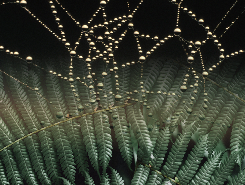
The image below was created for a narrative centered on my Obsidian writing template by searching for “frames,” “grids,” and “nature.”

By focusing on emotions rather than objects, you might uncover surprising visuals that resonate with your theme. I never expected a spiderweb to emerge from my search, yet it perfectly embodied the themes of structure and flexibility.
Always give credit to the creators of the images you use, whether they are free or not.
Tools of the Trade
For image manipulation, I often use Affinity Designer, but you can achieve similar results with Canva’s transparency features. Vectornator is another excellent free tool with an easy learning curve, particularly good for tracing images.

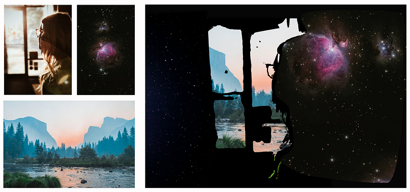
Using Vectornator, I successfully integrated three different Unsplash photos to create a cohesive image. Additionally, PowerPoint or Keynote can also serve as effective platforms for assembling images.
Techniques to Experiment With
Here are some creative techniques to try out:
- Blend one image into another using an app like Affinity Designer.
- Use Canva to add a solid color overlay to an image.
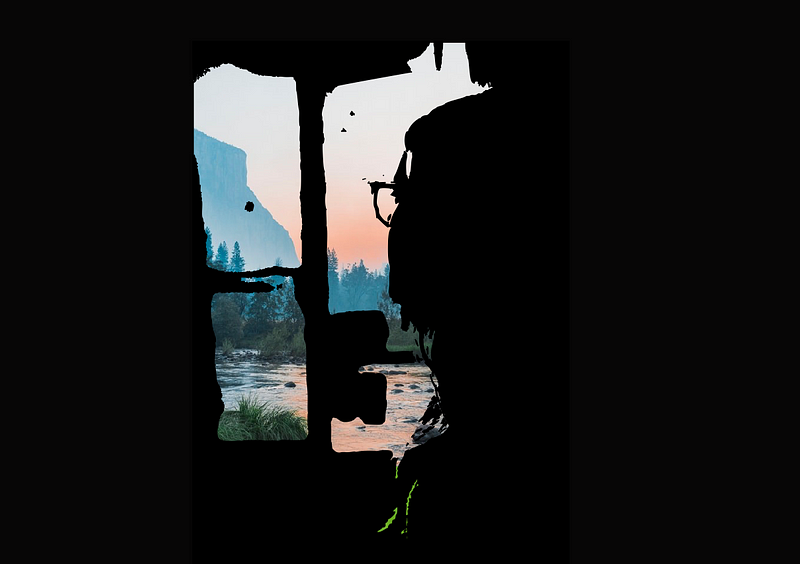
- Apply the Trace tool in Vectornator to simplify a bold photo.
- Experiment with cropping three images into strips and arranging them side by side.
Design Considerations
When combining images, keep these principles in mind:
- Select one primary image to dominate the visual narrative.
- Ensure all images complement each other to enhance the story.
- Aim for simplicity; sometimes, less is more.
- Pay attention to focal points and lead the viewer’s eye.
- Don’t overthink your choices; embrace spontaneity.

I often find that a simpler version of a complex image can convey a more profound message.
Extra Tips to Enhance Your Process
Remember to prioritize SEO! Renaming your images during the import process can significantly improve their visibility.
Did you know that you can paste screenshots directly into your editor? This method streamlines your workflow and saves time.
In conclusion, by utilizing free tools and creative strategies, you can quickly produce unique cover images that enhance your storytelling. Familiarize yourself with design principles, and don’t hesitate to bend the rules to create something truly remarkable.